Hours
Monday to Friday: 9AM - 5PM

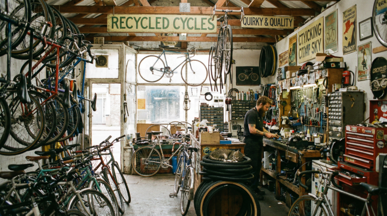
Bike Shop Homepage Mistakes That Quietly Cost You Sales
Most bike shop websites don’t fail dramatically.
They work.
Orders come through.
Customers find what they need — eventually.
The problem isn’t collapse.
It’s slow performance loss.
And the homepage is usually where that loss starts.
A homepage doesn’t just show products. It tells customers whether your shop is current, active, and paying attention. When it falls behind, trust erodes quietly — and sales follow.
Here are the most common homepage mistakes we see in independent bike shop e-commerce.
1. A Homepage That Never Changes
If your homepage looks the same in March and October, it’s invisible.
Bike retail is seasonal. Customers expect your site to reflect what’s happening right now:
- Spring builds
- Service season
- Back-to-school commuting
- Holiday gear
- Clearance transitions
A static homepage signals neglect, even if inventory is flowing perfectly.
Freshness builds confidence. Stale pages feel abandoned.
Simple fix:
Schedule a homepage review at the start of every season. Treat it like resetting the front window of the shop.
2. Featured Products That Aren’t Actually Featured
Many shop homepages show whatever products happen to land there.
That’s not merchandising — that’s gravity.
A homepage should guide attention, not mirror your database. Highlight:
- Priority bikes
- High-margin accessories
- Service packages
- Seasonal essentials
Customers read homepage placement as recommendation. If everything looks equal, nothing stands out.
Simple fix:
Choose 6–12 intentional featured items and rotate them monthly.
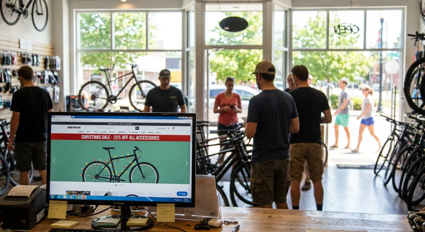
3. Service Is Buried or Missing
Your service department is your strongest differentiator from large online retailers — yet many shop websites treat it like a footnote.
Customers shouldn’t have to hunt for:
- Tune-ups
- Suspension service
- Assembly
- Booking info
If service isn’t visible from the homepage, you’re hiding your advantage.
Simple fix:
Add a visible homepage entry point to service.
4. Old Promotions That Never Left
Nothing erodes trust faster than expired messaging.
If customers see:
“Spring Sale” in July
“Holiday Deals” in February
they assume the site isn’t maintained.
Even if pricing is correct, perception isn’t.
Simple fix:
Audit homepage banners monthly. Remove anything outdated immediately.
5. Mobile Neglect
Most bike shop customers first encounter your site on a phone.
If mobile feels clumsy:
- buttons too small
- banners too tall
- navigation buried
the entire shop feels harder to trust.
Mobile isn’t a secondary experience anymore — it’s the front door.
The Real Issue Isn’t Design
None of these problems require a rebuild.
They’re operational.
Homepage drift happens when no one owns the day-to-day work. The site exists, but it isn’t actively managed. Over time, the gap between what the shop is doing and what the homepage shows gets wider.
Customers feel that gap instantly.
What Healthy Bike Shop Homepages Have in Common
Strong shop homepages share a few traits:
- Seasonal awareness
- Intentional merchandising
- Visible service support
- Clean, current messaging
- Regular small updates
Not flashy.
Not overdesigned.
Just maintained.
Consistency beats redesigns.
A Final Thought
Most bike shop e-commerce doesn’t lose because of technology.
It loses because no one is responsible for keeping it current.
A homepage should feel alive. When it does, customers trust the rest of the shop more — online and in person.
That trust turns into sales quietly, the same way neglect costs them quietly.
This is the kind of steady, behind-the-scenes work Upline helps independent bike shops stay on top of — keeping online stores current without adding more to an already full workload.