Hours
Monday to Friday: 9AM - 5PM

For the majority of independent bike, snow, and outdoor shops, the service department is the engine room. It’s the high-margin heart of the business, the primary driver of foot traffic, and the biggest differentiator against direct-to-consumer (DTC) brands. Yet, if you look at the average specialty retail website, the service department is treated like an afterthought—hidden in a “Services” tab or buried in the footer.
In the world of e-commerce, we often get distracted by “selling boxes.” We focus on cart conversion and shipping rates. But for a local shop, your website’s most important job might be selling a tune-up.
The Service Visibility Gap
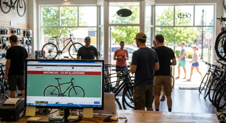
Most shop homepages are dominated by manufacturer-provided banners. While a high-resolution photo of a $10,000 mountain bike looks great, it doesn’t communicate your shop’s unique value. It communicates the brand’s value.
If a customer is on your site, they likely already know the brands you carry. What they don’t know—and what they are often looking for—is how you can help them keep their gear running. According to National Bicycle Dealers Association (NBDA) research, service and repair are consistently the top reasons customers choose a local shop over an online giant. If your website doesn’t reflect that, you are misaligned with your own strengths.
The UX of Expertise
User Experience (UX) isn’t just about pretty buttons; it’s about reducing the friction between a customer’s problem and your solution.
1. The “Three-Second” Rule
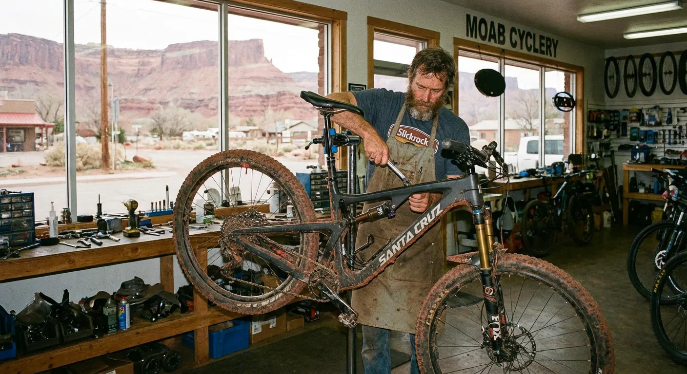
When a user lands on your homepage, they should know within three seconds that you are a full-service center. This requires a “Hero Balance.” Instead of three rotating slides featuring different bike models, dedicate one of those primary slots to your service department. Use a real photo of your service lead or your tool bench.
Authenticity builds trust. As noted in Nielsen Norman Group’s research on visual hierarchy, users respond more to “information-carrying” images than generic stock photography. A photo of your actual shop floor tells the customer: “We are real people who can fix your actual bike.”
2. The “Book Now” Friction
If your “Service” page consists of a wall of text listing prices and a phone number, you are losing the younger demographic. Modern consumers—especially those in the “Outdoor Participation” boom—prefer digital scheduling.
Whether you use HubLogix, Lightspeed’s service module, or a simple Calendly integration, the “Book a Tune-Up” button should be a high-contrast element in your header. It shouldn’t be hidden. It should be as prominent as the “Shop Now” button.
3. Service-First Merchandising
Good UX means predicting what the customer needs next. If a customer is looking at a high-end drivetrain component or a suspension fork, your product page should include a “Need this installed?” call-to-住所.
Linking your high-intent product pages directly to your service booking page is a classic example of Internal Linking that benefits both the user and your SEO. It tells Google that your service department is contextually related to the premium products you sell.
Supporting the Shop Floor, Not Competing With It
A common fear among shop owners is that e-commerce will “cannibalize” the in-store experience. In reality, a well-optimized website acts as a 24/7 concierge for the shop floor.
Promoting Tune-Ups and Pre-Season Prep
Service is seasonal. In February, you should be pushing “Pre-Season Overhauls.” In July, it’s “Quick Turnaround Flats and Adjustments.” Your website needs to change its “merchandising” of service just as often as you change your apparel displays.
By using Schema.org markup for Services, you can help search engines like Google and AI tools like Perplexity understand that you offer “Bike Repair” in a specific geographic area. This increases your chances of appearing in the “Local Map Pack” when someone searches for “bike repair near me.”
The Operational Reality: Who Updates the Site?
The biggest hurdle isn’t the idea of service promotion; it’s the execution. Shops are busy. When the sun comes out and the service lead time jumps from two days to two weeks, the last thing the Service Manager has time to do is log into the website backend to update a banner.
This is where “having a site” vs. “running a site” becomes clear.
- The “Having a Site” Shop: Still has a “Spring Tune-Up Special” banner live in August.
- The “Running a Site” Shop: Updates their lead-time notices weekly so customer expectations are managed before they even walk in the door.
UX Mistakes That Cost You Sales
Beyond service, there are several “small” UX mistakes specialty retailers make that drive customers back to Amazon or major DTC sites:
- The “Infinite Scroll” Without Filters: If you have 400 tires, but no way to filter by “29-inch” or “Tubeless,” your customer will leave.
- Hidden Shipping Costs: According to Baymard Institute’s checkout usability studies, “extra costs” (like unexpected shipping) are the #1 reason for cart abandonment. Be transparent about your local pickup options and shipping rates early in the process.
- Mobile Navigation: 70% of your traffic is likely on mobile. If your menu is a mess or your “Add to Cart” button is below the fold, you are essentially closing your front door to 7 in 10 customers.
The Bottom Line
Your website is your shop’s digital twin. If your physical shop is known for its incredible mechanics and expert advice, your website should be too.
Don’t let your e-commerce platform turn you into a generic, faceless warehouse. Use your site to highlight the expertise that makes your shop worth visiting in the first place. When you optimize your UX for service and expertise, you aren’t just selling products—you’re building a relationship.
This is the kind of operational maintenance Upline specializes in. We ensure your digital presence reflects the hard work you’re doing on the floor, keeping your service department front and center where it belongs.